
GRAPPLING WITH THE GHOSTS OF CARIBBEAN COLONIALISM
LIFE, LANDSCAPE AND LITHOGRAPHY

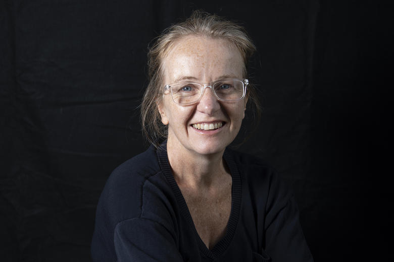
Credit: Rachel Gracey
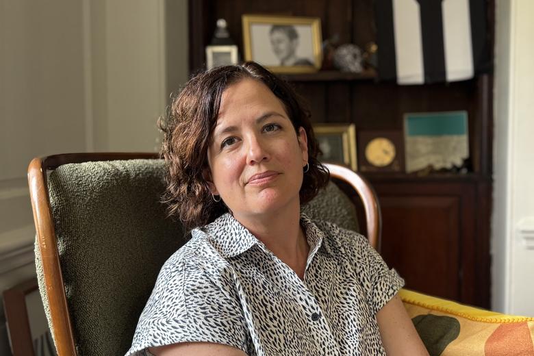
Rachel Gracey is one of the great talents in contemporary British printmaking. She also happens to live in Oxford, a not inconsiderable fact because the backdrop of parks and open spaces such as Port Meadow have occupied a central part of her vision over the past decade.

Rachel Gracey in her Oxford studio
Credit: University of Oxford/Richard Lofthouse
Rachel Gracey stands out in the current British printmaking scene for her commitment to lithography. Lithography is based on the idea that oil and water repel. When writing or drawing with a grease-based substance on a flat limestone (wax crayons, a greasy ink called tusche, pencils), oil-based inks adhere to this surface, while being repelled by water in non-printing areas of the stone. This occurs when the surface of the stone or plate is covered in a solution of gum arabic and nitric acid, creating grease-receptive image areas, and water-receptive non-printing areas. The name ‘lithograph’ derives from the Latin terms for stone (litho) and mark (graph). It is a very sensitive medium that reflects and intensifies the sensitivity of Rachel's drawn studies.
Alois Senefelder, a German playwright, invented lithography in 1796. In the early nineteenth century, artists such Theodore Géricault and Eugène Delacroix saw the potential of this new medium to produce prints with a more immediate sense of draughtsmanship and a much greater range of tonal modelling than older methods of printmaking such as engraving, woodcut and etching.
During the mid-twentieth century, the pace of new artistic media developed with incredible speed and lithography became only one of many print processes available to artists, ranging from Warhol's silk screen printing in the 1950s to digital prints of ipad landscape drawings by David Hockney.
Gracey works on a Mann Direct Press acquired from Plymouth University in 2015 – thought to be one of just three remaining – in a garden studio at her home in Summertown, Oxford. The printing bed of approximately 3ft x 4ft allows her to work on a very large scale.

Mann Direct Press
Rachel Gracey stands in a long tradition of British landscape artists. Oxford has dominated recent years. She speaks of the importance of familiarity. Trees, paths and ponds become familiar, and she intuitively perceives the rhythm and shapes of these landscapes. Favourite places include the University Parks and Port Meadow, where she walks a one year old fox terrier called Giacometti. Her one rendering of a college, Keble, is unique in her oeuvre and was never designed to be a rendering of a college. ‘It was an extension of landscape seen from the Parks; the way that forms pile up on the edge of a space, the way that buildings may frame or intensify a landscape.’

A Walk in the Parks 14 [River Cherwell, eastern boundary of the University Parks, Rainbow Bridge]
Credit: Rachel Gracey
Gracey’s landscapes capture both the momentary and the timeless: she conveys the fleeting patterns of clouds, the vibrancy or dullness of a day, the movement of trees, the reflection of light in water. But she also captures the ongoing process of decay and regeneration, colour, and absence of colour, in the cycle of the seasons. Her work celebrates the daily and seasonal cadences of parks, woodlands and coastal vistas with the eyes of someone who does not take these small miracles for granted.

The Parks 18
Credit: Rachel Gracey
Gracey prints all her own work and usually begins with pulling 12-15 impressions of the first plate to begin making an edition. Each colour in the finished work (normally she works with about 6 to 8 colours) represents an individual plate in the printing process. Each plate must be printed separately and hung for five days to dry. In her experience it is while printing the last two or three plates, that impressions have to be discarded from the edition. If, for example, she mixes a particular tone for colour seven and feels it is not right when printed, the impression has to be rejected, despite it having been patiently printed and hung for almost six weeks in her studio already. This helps to explain the meticulous sense of a lithograph being wrought. It is a very physical process in a very digital age. She says, ‘People think I’m able to press a button and print off many, like a photocopier. This is a total misunderstanding of lithography. I can sometimes aim for an edition of 12 and end up with just 3 or 4. But that’s absolutely correct and I like it that way. It’s not a commercial production line.’

A Walk in the Parks 10
Credit: Rachel Gracey
Gracey is in constant dialogue with colour, ‘a definite fight: sometimes you tell it, and other times it tells you, and shapes the mood.’ Colour in her work is not simply about capturing visual experience as she encounters it in the landscape. It is about overlaying the forms and shapes of the landscape with her own subjective responses of memory, emotion and passing time.

A Walk in the Parks 7
Credit: Rachel Gracey
Gracey draws on the legacy of artists who have inspired her. She recalls her conversations with Albert Irvin when he was a guest teacher at Wimbledon College of Art and after he marked her prize-winning MA work in the mid-1990s. Irvin (1922-2015), the British Abstract Expressionist for whom colour was a life force within the space of the image, told a young Gracey, “Do not be afraid of colour,” and this advice has reverberated down the years whenever she has been tempted to play it safe.

The Parks 22
Credit: Rachel Gracey
While Abstract Expressionism has been a dominant influence on Gracey, she has never embraced a purely abstract art, and has remained loyal to the figurative tradition. Gracey’s landscapes always begin with a source and a drawn element. She fills sketchbooks with drawings in pencil and biro to observe the linear shape of things; and watercolour to study the play of light, tone and colour in real places.
Rachel Gracey’s work is not only technically demanding and visually arresting, it is also eminently liveable with. It is optimistic and life-affirming, conveying a sense of identity rooted in belonging to the landscapes of everyday life and living with its changing seasons. In her subjective approach to colour and form, Gracey celebrates the pleasure of looking and making in her own distinctive style.
move to carousel movement controls
 Pause slideshow
move to carousel content
Pause slideshow
move to carousel content
ADAM SMITH
ADAM SMITH
CONSERVATION AND WAR STUDIES JOIN HANDS
CONSERVATION AND WAR STUDIES JOIN HANDS
YOUR SUMMER GUIDE TO OXFORD
YOUR SUMMER GUIDE TO OXFORD

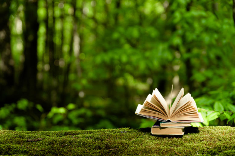
OFF THE SHELF: JUNE 2026
OFF THE SHELF: JUNE 2026
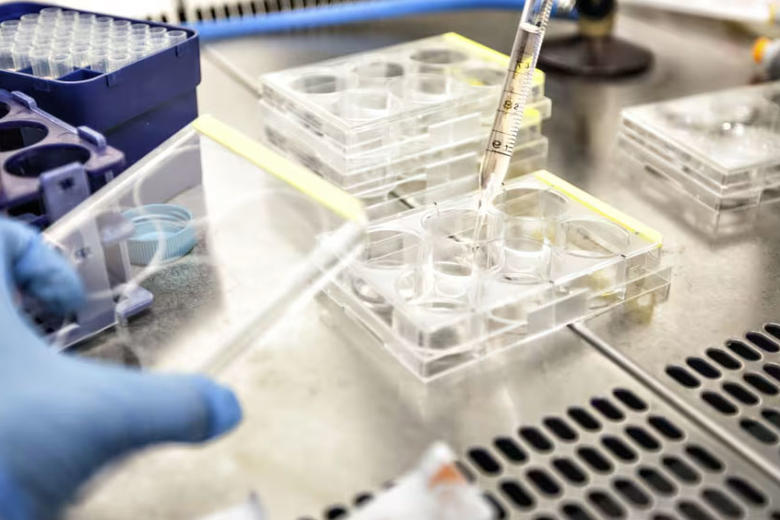
EBOLA: WE NEED MORE THAN A VACCINE
EBOLA: WE NEED MORE THAN A VACCINE
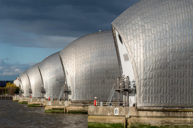
30 YEARS OF THE THAMES PATH
30 YEARS OF THE THAMES PATH
ANOTHER WORLD
ANOTHER WORLD
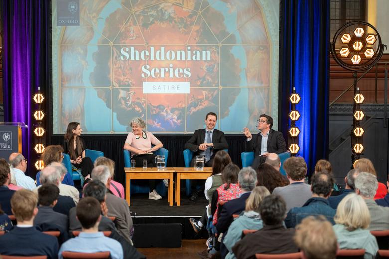
SATIRE COMES TO THE SHELDONIAN
SATIRE COMES TO THE SHELDONIAN
OFF THE SHELF: MAY 2026
OFF THE SHELF: MAY 2026
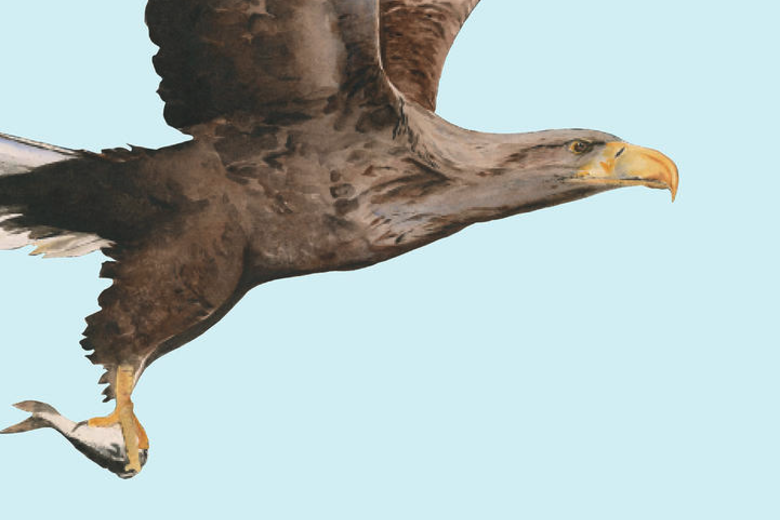
THE WONDER OF BIRDS
THE WONDER OF BIRDS
FRAN MONKS